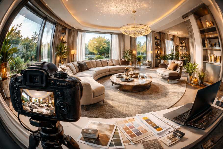
Traditional design often prioritises a primary viewpoint—a sofa facing a window, a bed framed by symmetry, a dining table aligned beneath a statement light. In a panoramic setting, that hierarchy dissolves. The entire room becomes the focal point, which means weak spots can no longer rely on polite obscurity. That stack of magazines casually abandoned in the corner is no longer charming; it’s now a featured exhibit.
Lighting That Holds Up Under Scrutiny
Lighting is where many spaces either shine or quietly unravel. A single overhead fixture might feel adequate in person, but in a 360° view it can create uneven brightness, harsh shadows, and pockets of gloom that suggest the room is hiding secrets. Layered lighting becomes essential—not as a design luxury, but as a structural necessity.Ambient lighting should provide a consistent base, while accent and task lighting add depth and interest. Soft, indirect sources tend to perform better than stark directional beams. Lamps, wall lights, and even strategically placed reflective surfaces can help distribute light more evenly. If a room looks like it has a favourite corner, it probably needs more balance.
Natural light deserves special attention. Windows often dominate a scene, and without careful management, they can either blow out the image or leave the rest of the room looking underexposed. Sheer curtains, diffused blinds, or thoughtful positioning can soften this contrast. The goal is not to eliminate drama entirely, but to ensure the room doesn’t resemble a stage with one spotlight and a lot of darkness.
Layouts Without a Backstage
Furniture placement in a 360° environment demands honesty. There is no “good side” to rely on. Pieces must work cohesively from every angle, which often means rethinking traditional arrangements. Pushing everything against the walls can make a space feel hollow and disconnected, while overly dense layouts can feel claustrophobic when viewed in motion.Creating flow is key. Viewers should be able to mentally move through the space without encountering visual obstacles. This doesn’t mean stripping the room of personality, but it does mean editing with intent. A well-placed chair can anchor a corner; five chairs can start to look like a waiting room that forgot its purpose.
Consider how lines of sight interact. In a panoramic view, sightlines intersect in ways that aren’t obvious in static photography. A poorly aligned piece can disrupt the visual rhythm of the entire room. Subtle adjustments—angling a sofa slightly, repositioning a table, or shifting artwork—can make a significant difference. It’s the difference between a room that feels considered and one that feels like it was assembled in a hurry five minutes before someone arrived with a camera.
Styling for Continuous Attention
Styling in this context is less about adding and more about refining. Every object must justify its presence, because there are no blind spots to forgive excess. Decorative elements should feel intentional rather than accidental. A single well-chosen accessory can elevate a space; a cluster of mismatched items can turn it into a visual puzzle no one asked to solve.There’s also a pacing element to consider. As viewers explore a space, their attention moves gradually rather than jumping between frames. This creates an opportunity to guide the experience subtly. Repeating colours, textures, or shapes can create cohesion, while small points of interest encourage exploration. The trick is to maintain engagement without overwhelming the senses.
Overstyling is a common pitfall. It often begins with good intentions—adding cushions, layering throws, introducing decorative objects—until the room starts to feel like it’s trying too hard. If a space looks like it might apologise for itself if left alone, it’s time to scale back.
Practical Staging That Survives a Full Rotation
Preparing a space for a 360° presentation requires a level of discipline that goes beyond a quick tidy-up. It’s not just about what’s visible—it’s about what becomes visible once the viewer decides to turn around. The usual strategy of shuffling clutter slightly out of frame is no longer an option. Everything must earn its place, including the items that normally live just out of sight.Start with a clean baseline. Surfaces should be clear enough to feel intentional, but not so bare that the room appears unlived. This balance can be surprisingly delicate. A coffee table with nothing on it looks abandoned; a coffee table with eight carefully arranged objects looks like it’s hosting a small exhibition. Somewhere in between is where things begin to feel believable.
- Remove unnecessary duplicates—one statement piece is stronger than three similar ones.
- Keep cables, bins, and overly functional items discreet or repositioned.
- Use symmetry sparingly to create calm without making the space feel staged.
- Check reflections in mirrors and glass—these often reveal what you thought you’d hidden.
Textures, Materials, and the Illusion of Depth
Flat surfaces tend to lose their appeal in immersive formats. Without texture, a room can feel lifeless, even if it’s technically well-designed. Materials that interact with light—such as wood grain, soft fabrics, or subtle metallic finishes—help create depth and visual interest as the perspective shifts.Layering textures can elevate a space significantly, but restraint is essential. Too many competing materials can make the room feel busy, especially when viewed continuously. The aim is to create variation without chaos. A smooth surface next to something tactile often works better than an entire room competing for attention.
Rugs, cushions, and soft furnishings can anchor a space effectively, but their placement should feel natural rather than overly precise. If everything looks like it has been measured down to the millimetre, the room risks losing its sense of ease. A slight imperfection can be more convincing than rigid perfection.
Finishing Touches That Feel Effortless
Final adjustments often make the biggest difference. These are the small refinements that elevate a space from acceptable to quietly impressive. Fresh flowers, neatly arranged books, or a carefully placed piece of art can add life without overwhelming the scene. The goal is to suggest a lived-in quality without introducing distraction.Scent might not translate visually, but its visual proxies do. A bowl of fruit, a set dining table, or a softly draped throw can imply comfort and warmth. These cues help viewers imagine themselves in the space, which is ultimately the point. If a room feels inviting without trying too hard, it has done its job well.
Attention should also be given to transitions between spaces. Doorways, hallways, and connecting areas are often overlooked, yet they play a crucial role in how a space is experienced as a whole. A beautifully styled room can lose its impact if it opens into a neglected corridor that looks like it gave up halfway through.
Around Every Corner Counts
Designing for a 360° view rewards thoroughness. There’s no shortcut around it, and no clever angle to rely on. What remains is a space that stands on its own merits, consistent and considered from every direction. When everything aligns—lighting, layout, styling, and detail—the result feels natural, even if a great deal of effort went into making it look that way.A well-prepared space doesn’t announce itself loudly. It simply works, no matter where the viewer chooses to look. And if nothing unexpected appears when they turn around, that alone is a quiet achievement worth appreciating.
Article kindly provided by sonarstudio.co.uk